

According to research, readers are 30 times more likely to read infographic examples than plain-text articles. This makes perfect sense since 65% of the world’s population learns visually.
Posts with infographics create 650% more engagement than those without, and they’ve become vital tools in modern communication. We like infographics because they can revolutionize your content strategy, whether you’re a designer looking for inspiration or a marketer aiming to boost engagement. These visual tools make complex information digestible instantly. They improve educational learning by 400% and increase website traffic by 12%.
Want to lift your design game with 12 creative examples? Let’s tuck into this handpicked collection of infographics that blend data, visuals, and storytelling perfectly.
1. Color Coded Data Visualization
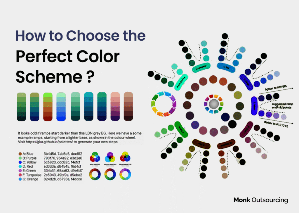
Colors speak to us before words do. Information is Beautiful’s “Colours in Cultures” visualization shows how smart color choices can turn complex data into easy-to-understand knowledge. David McCandless and AlwaysWithHonor.com created this infographic that reveals how different cultures interpret colors through advanced color psychology.
How Color Psychology Improves Data Comprehension?
Our brains process colors faster than other visual elements. This makes color a powerful tool to guide attention toward important data points. Research shows that color makes readers pay attention 82% longer and remember information 39% better. It also increases readership by 80%. The brain’s emotion center, the limbic system, responds to colors within 90 seconds.
Smart use of colors in data visualization creates these effects:
- Directs attention to important data points through contrast
- Encodes meaning by using different colors for categories
- Communicates relationships between data points through color blending
- Sparks emotion that matches the intended message
- Improves recall through well-planned color palettes
Design Elements That Set This Infographic Apart
Information is Beautiful’s visualization stands out because of its balanced approach to color harmony. The design follows the 60-30-10 rule – 60% dominant color, 30% secondary color, and 10% accent colors. This balance prevents visual chaos even with complex cultural data.
The infographic uses a limited color palette, which design experts recommend to avoid overwhelming viewers and disrupting information flow. This restraint helps create a clear visual hierarchy that lets readers quickly understand cultural differences in color interpretation.
Why Does This Example Work With Complex Data Sets?
Our eyes can distinguish more than 10 million color variations. The visualization utilizes this sensitivity to show multiple layers of cultural meanings in one view. Color-coded visualizations help people grasp complicated information quickly.
The design team considered accessibility and cultural context since people interpret colors differently worldwide. They paired colors with concepts that naturally match them, which leads to faster understanding. The infographic is an excellent example of using color psychology to turn complex cross-cultural data into clear, memorable insights.
2. Interactive Timeline
Static information becomes memorable experiences through interactivity. Two-N’s interactive timeline infographics represent how dynamic elements can reshape the scene of data storytelling through user participation, animation, and innovative design approaches.
Interactive Elements That Engage Users
Users can hover over sections or click categories in interactive timelines to expand complete information. Make it a modern and brilliant infographic design for students & businesses, too. This creates an immersive experience instead of passive consumption. Dynamic presentations let users uncover additional details by interacting with elements like headers, icons, timeline bars, images, and popups.
This approach offers real advantages:
- Users pay more attention and participate actively.
- The information unfolds gradually without overwhelming viewers.
- Users explore based on their interests.
- Content has higher viral potential than static versions.
Research shows that 85% of B2B marketers either use or plan to use interactive infographics in their strategy. This highlights how brands can stand out from competitors.
How Animation Enhances Information Retention?
Animation brings static numbers and facts to life and turns them into dynamic visual experiences. Complex information becomes more available and easier to understand for wider audiences. Research shows that people remember visual information better than text-based content.
Animation plays several vital roles in infographics:
- Guides viewers through information step by step, controlling data flow.
- Makes complex ideas easier to digest.
- Draws attention to key points or data.
- Shows processes and cause-effect relationships better than words alone.
Applying Similar Techniques To Your Designs
You can add interactive elements to your infographics with these practical techniques:
Add clickable hotspots that reveal extra information without cluttering the main display. On top of that, micro-animations make your infographic catch the eye right away.
A narrative structure that reveals information gradually keeps curiosity alive. You might want to add multimedia elements like voice-overs or “lower thirds” text to reinforce concepts. People remember information better when they see and hear it.
Your interactive elements should work on all devices. This matters because many people view content on smartphones and tablets.
3. Minimalist Statical Infographics
Minimalist design creates the strongest impact in statistical presentations. A Forbes and Statista infographic about U.S. renter households facing eviction risk shows how removing unnecessary elements can increase data’s impact. Their collaborative work proves that smart design choices make complex statistics more available and meaningful.
The Power Of Simplicity In Data Presentation
Statistical infographics work best when they simplify complex information into essential insights. Forbes and Statista’s approach combines graphs, charts, and figures to present numerical data and trends. Creators must remove extra information and focus on what viewers need to understand.
Clean, simple infographics achieve two key goals. They make complex statistics visually clear and deliver influential insights without overwhelming the audience. Studies show that infographics combining visual elements with small chunks of information help people remember better because our brains store images more effectively than words or numbers alone.
Using Negative Space Effectively
The Forbes-Statista visualization uses negative space, the empty areas between elements, as a powerful design tool. This visual breathing room lets the viewer’s eyes rest between data points and ends up improving understanding by up to 20 percent.
Smart use of negative space brings several benefits:
- Makes text easier to read
- Reduces mental strain when processing statistics
- Creates natural flow between elements
- Draws attention to important content
Color Choices That Enhance Readability
Forbes-Statista’s infographic uses a yellow-to-dark-red spectrum that quickly shows data severity across states. Their approach proves that color isn’t just decorative, it’s a crucial tool that affects understanding and participation.
The color-coding system follows best practices by using fewer than ten distinct colors. This limitation prevents eye fatigue while keeping colors distinct enough from the background.
The well-designed legend makes navigation simple. Even people new to data visualizations can quickly understand the information. This smart mix of minimalist design, strategic space, and purposeful color choices creates an infographic that balances visual appeal with clarity.
4. Education Process
National Geographic turns complex educational concepts into engaging visual narratives. Their infographics show how well-designed visual content can connect dense information with meaningful learning experiences.
Storytelling Techniques In Educational Infographics
National Geographic turns educational content into powerful visual stories that boost understanding. Their infographics utilize narrative structures to guide viewers through information step by step. This makes complex data available to general audiences. Visual stories create emotional connections that improve retention more than text alone.
Educational infographics that work well use these storytelling approaches:
- Build a framework – Breaking complex topics into progressive learning steps.
- Regional contextualization – Making global issues relatable by highlighting local effects.
- Visual metaphors – Using familiar imagery to explain unfamiliar concepts.
- Emotional resonance – Creating a personal connection to factual information.
Designer Kelsey Taylor points out in her National Geographic project, “Infographics can tell a powerful story by taking data and making it information. They communicate it in a way that people can understand”.
Balancing Text And Visuals For Learning
The human brain processes images 60,000 times faster than text. This makes the visual-textual balance vital to educational success. National Geographic maintains what experts call the “right balance.” They provide enough information to answer questions with the right visual elements to boost understanding.
Their infographics keep text brief while using charts, illustrations, and photographs to show complex relationships. Visual learners who find text-heavy formats challenging benefit from this approach.
How To Structure Complex Educational Content?
National Geographic builds its infographics in a hierarchy. They organize information in logical sequences that guide readers through different steps, processes, or hierarchies. Complex ideas become easier to digest through this approach.
Skeptical audiences can understand difficult concepts like climate change better when they see relatable, well-laid-out visual data. The team uses step-by-step explanations that begin with general context. They move gradually to more specific points. This ensures complex educational material becomes available without losing accuracy or depth.
5. Comparison Infographics
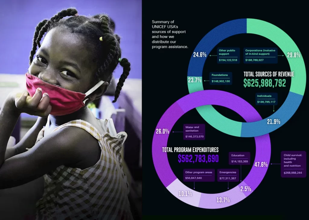
Comparison infographics turn complex data into clear decisions by presenting information side by side. UNICEF’s infographics show how data-heavy content becomes visually engaging and digestible through smart design choices.
Effective Side-By-Side Data Presentation
Comparison infographics split information down the middle, either vertically or horizontally, with options on each side. Readers can see differences and similarities at a glance without flipping pages or scrolling through content. Thus, it is also a popular infographic example for businesses. UNICEF’s designs use this approach to show unbiased comparisons or highlight when one option stands out.
Side-by-side comparisons offer these advantages:
- Quick evaluation of complex trade-offs
- Better understanding through visual organization
- Quick spotting of key differences
- Easier decision-making for viewers
Lawal Bakare’s infographic for UNICEF demonstrates this perfectly. Detailed geographic snapshots of each country appear on the left, while color-coded data bars and comparative statistics fill the right side.
Visual Hierarchy In Comparison Infographics
Visual hierarchy leads viewers through information naturally. UNICEF places elements strategically based on F-pattern and Z-pattern eye movement principles. The most crucial details appear in the upper left corner, where people start scanning.
UNICEF organizes information with different types, sizes and weights to highlight key points. Their designs leave enough white space to group related information and separate different data sections. This helps readers process complex information more easily.
Color Coding For Instant Comprehension
Color coding serves as a powerful tool in UNICEF’s designs for quick data interpretation. Their infographics follow color psychology principles: green naturally signals positive outcomes, while red shows concerning statistics.
UNICEF presents comparative statistics in colored cards with clean geometric borders in light gray or bold black. This color system helps viewers grasp data relationships quickly, a crucial feature when quick understanding leads to better decisions.
6. Geographic Data Visualization
Maps tell stories that numbers alone cannot convey. CB Insights has become skilled at geographic data visualization. They use map-based infographics to translate complex spatial information into user-friendly visual narratives that clearly show patterns.
Map-Based Infographic Design Principles
Good map infographics compress big amounts of geographic data into digestible visual formats that readers process quickly. CB Insights adds subtle shapes and colors to traditional data tables. This helps viewers spot key information instantly. These visualizations serve as universal communicators that surpass language barriers through visual symbols and patterns.
CB Insights’ approach starts with a simple question: Does location matter to the story? Data that can be mapped doesn’t always need to be. Their maps excel at showing US banks’ fintech investment choices and highlighting top-funded tech startups in different regions.
Using Scale And Proportion In Geographic Data
Scale choices shape how geographic stories unfold. CB Insights picks scales based on the story’s geographic scope and key details needed for understanding. Physical bubbles help viewers see magnitude better than pure numbers.
Proportion shows relationships between parts or to a whole. This helps illustrate comparisons between regions. The technique works well to show funding differences between startups in various locations. Abstract financial data becomes tangible immediately.
Color Gradients To Represent Data Intensity
CB Insights uses vibrant color gradients with a scale-based system to create clear pictures of data intensity. Dark colors represent higher values, while light colors show lower values, following standard cartographic principles.
They limit color palettes to 3-5 colors. This prevents visual fatigue from complex color schemes. The restriction boosts visual hierarchy. Viewers quickly learn about geographic patterns like market activity, investment trends, or startup funding across countries and regions.
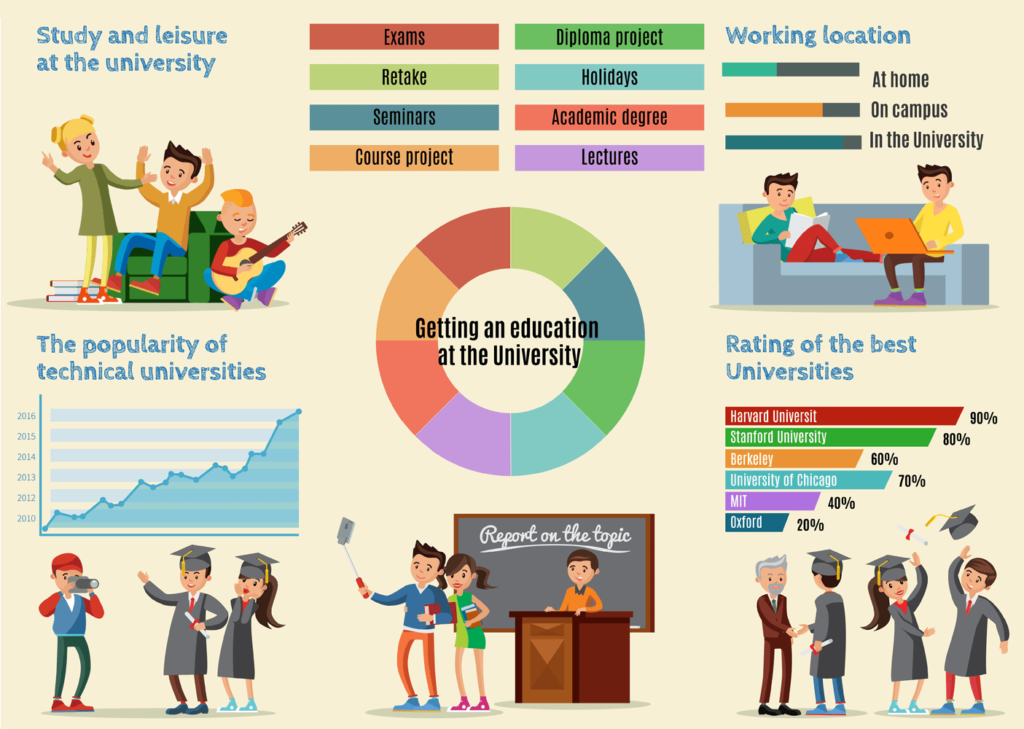
7. Step-By-Step Guide
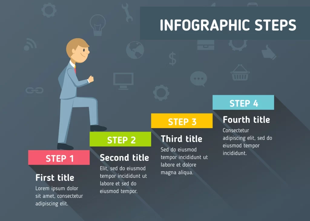
Step-by-step tutorials transform into visual roadmaps when skilled designers create them. Instamojo’s process infographics show complex procedures with clear directions. They make intricate workflows easy to understand at a glance.
Breaking Complex Processes Into Visual Steps
Instamojo makes complex information simple by breaking it into manageable visual chunks. Their process of infographics follows a basic principle. They start with a clear, bold header that sets the topic and divides the content into numbered steps. This method turns overwhelming procedures into bite-sized segments.
Their approach stands out because of the:
- Create distinct sections with clear boundaries for each step
- Keep formatting elements consistent throughout all stages
- Add icons and illustrations that support written instructions
- Mix visual elements with short explanatory text
Instamojo’s infographics show that process visualization works best when designers identify one main process. They explain it step by step and map out a clear beginning, middle, and end.
Using Directional Cues To Guide The Reader
Visual flow plays a vital role in process infographics. Instamojo adds directional indicators like arrows, lines, and numbered sequences and became successful in maintaining its presence in the top best infographic examples. These create a natural progression through their content. Visual cues guide viewers from one step to the next without explicit instructions.
Their infographics feature S-shaped layouts to save space while keeping a logical flow. Complex multi-step processes fit into a single visual this way. The sequential nature of instructions stays intact.
Typography Choices For Instructional Content
Font selection affects the effectiveness of instructional content communication. Instamojo’s typography shows that fonts can function as both text and visual elements.
They use different typefaces and weights to create a visual hierarchy. Step numbers and headers appear in larger, bolder fonts. Explanatory text stays in readable style. This creates a clear visual difference between information types.
Their typography matches both the environment and the audience. This careful selection makes instructional infographics available to everyone while keeping brand consistency.
8. Health & Wellness

Medical concepts become clearer when shown through the familiar canvas of our bodies. Anxiety.org’s infographics show how health information becomes relatable instantly through anatomical illustrations, smart color choices, and thoughtful design elements.
Using Human Body Illustrations In Health Infographics
Human body diagrams work like universal translators for complex medical information. Designers can choose from more than 44,000 human body system infographic templates. These anatomical illustrations give immediate context and help viewers spot symptoms and understand body processes without medical jargon.
Body-based infographics bring several benefits:
- They create personal connections through familiar shapes
- They show where symptoms and conditions appear
- They make complex medical processes easier to understand through visual mapping
Anxiety.org uses human figures to show how stress shows up in our bodies. Their approach highlights tension points and body responses that we might not see otherwise. This makes invisible mental health conditions easier to understand and see.
Color Psychology For Health-Related Information
Colors shape how people take in and process health information. Studies show that 93% of consumers make decisions based on visual appearance. This same principle applies to how people absorb health information.
Different colors trigger specific responses in health settings:
- Blue brings calmness and security, reduces appetite, and boosts productivity.
- Green represents health and peace, creating balance and harmony.
- Red signals alertness and safety, adding urgency and intensity.
Anxiety.org uses these principles in its stress management infographics. They use calming blues and greens to help people feel in control and add much red to point out warning signs.
Balancing Scientific Accuracy With Visual Appeal
Great health infographics find the sweet spot between scientific accuracy and engaging design. One expert says, “Color is a power that directly influences the soul.” Yet this emotional impact shouldn’t compromise facts.
We used storytelling, creative design, and efficient technology. This strategy worked well during pandemics, helping people understand complex health concepts.
The design choices must focus on accessibility. Anxiety.org’s infographics include multiple visual cues for viewers with color blindness. They use distinct shapes along with colors to make information available to everyone.
9. Social Media Statistics

Visual content makes professionals more likely to engage with LinkedIn. LinkedIn Marketing Solutions’ infographics turn statistics into compelling visual stories that grab attention. Professionals spend an average of 6 minutes and 7 seconds per visit on the platform.
Visualizing Engagement Metrics Creatively
LinkedIn infographics turn complex metrics into content that resonates with professional audiences. Visual representation of key statistics produces impressive results. Posts with images get 2x higher comment rates. Funny content gets 65% more engagement, showing how creative presentation affects viewer response.
Creative visualization makes statistics more straightforward to understand:
- Key metrics turned into comparative graphics.
- Data-backed illustrations that show growth trends.
- Color psychology that highlights positive outcomes.
Pages that post weekly see 5.6x more follower growth, proving the value of consistent visual content. LinkedIn’s professional audience values data visualization, and more than 40% of B2B marketers say LinkedIn gives them high-quality leads.
Using Platform-Specific Design Elements
LinkedIn’s infographics need specific design elements to work well. They should look professional while keeping brand elements consistent. Unlike other platforms, LinkedIn’s business focus means infographics must look polished and fact-based.
LinkedIn’s audience has decision-making power 4 out of 5 people on LinkedIn “drive business decisions.” The infographics should have these professional design elements:
- Clean layouts with enough white space.
- Professional color schemes (blues for trust, greens for growth).
- Straightforward typography that makes information easy to scan.
Infographic Sizing For Social Media Platforms
Right-sizing helps LinkedIn infographics display well on all devices. Shared posts work best at 1080×1080 pixels for square images and 1920×1080 pixels for portrait orientation. Link posts look best at 1200×627 pixels.
Vertical ads on LinkedIn get 31% more engagement than horizontal ones. This makes image orientation crucial. Carousel ads need individual images sized at 1080×1080 pixels with a 1:1 aspect ratio.
Image file specs play a vital role. JPG and PNG formats work best for LinkedIn images. Most content types should stay under 3MB. These specs help infographics maintain quality and load quickly.
10. Customer Journey Map
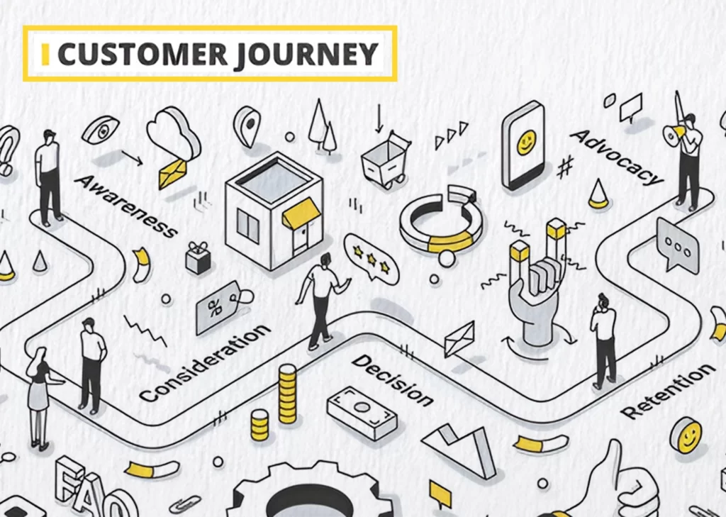
Customer journey map infographics show a complete view of customer interactions. Folo’s customer journey maps provide a visual blueprint that turns complex customer-brand relationships into clear pathways. This helps teams understand and make better strategic decisions.
Visualizing The Customer Experience
Step-by-step visual representations show how potential customers connect with your brand. These complete visualizations plot touchpoints, customer sentiments, pain points, and actions in sequence. The main goal goes beyond creating a simple timeline. Teams can promote empathy and help designers and stakeholders understand how customer needs and feelings change throughout their experience.
Journey mapping helps organizations in two vital ways. Teams gain deeper insights into target audiences, including customer needs and pain points. The process also brings internal teams together to deliver exceptional customer experiences.
Using Icons And Illustrations To Represent Touchpoints
Touchpoints are the foundations of journey map infographics. Every consumer interaction with your brand matters. Simple visual elements like icons and illustrations make these interactions easy to spot:
- Channel representations: Icons for websites, mobile apps, social media, and physical locations.
- Emotional indicators: Visual cues showing satisfaction, confusion, or frustration at each stage.
- Action symbols: Graphics representing specific customer behaviors or decisions.
These visual elements turn complex interactions into easy-to-understand symbols that readers can grasp quickly. Journey maps often use emotion heatmaps to work better. These color-coded visualizations show customer emotions throughout their trip.
Flow Indicators That Guide The Reader
Timeline-based structures show how customers move through awareness, consideration, purchase, and beyond. Clear pathways guide viewers through the customer experience with flow indicators like arrows, connecting lines, and numbered sequences.
The best journey maps organize information by importance. Visual cues effectively establish relationships between different stages and direct attention. Directional elements show customer movement between channels and highlight areas that need improvement.
Teams can use these visualizations to find gaps in customer experience. This helps businesses reshape current-state journeys into ideal future-state experiences.
11. Product Comparison
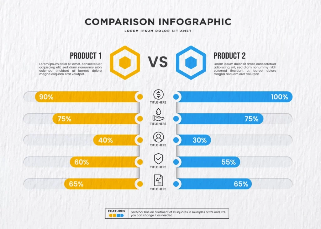
Product comparison infographics become powerful tools through strategic color choices that clarify differences between competing items. DesignMantic’s examples demonstrate how smart visual design reshapes complex feature lists into user-friendly decision tools for consumers.
Using Color Palettes To Separate Options
Color serves as a powerful communication tool that shapes viewer perception in product comparison infographics. Research proves that color boosts readers’ attention spans and recall by 82% and increases readership by 80%. Your original palette should stick to 2-3 colors. This prevents viewers from being overwhelmed yet maintains visual interest.
Color psychology can shape decision-making strategically:
- Green signals “go” or “good” options
- Red represents “stop” or less favorable choices
- Blue builds trust and security in financial comparisons
The 60-30-10 rule adds balance to product comparisons. You should use 60% of your design as the base color, 30% as a complementary color, and 10% as an accent color to emphasize key differences, standing as one of the best infographic examples.
Visual Organization Of Feature Comparisons
In effective product comparison, infographics, side-by-side layouts, tables, charts, and Venn diagrams help separate differences. Tables become visually appealing infographics through icons and strategic colors emphasizing relevant data.
The most influential product comparisons place matching data points horizontally. Pricing aligns with pricing, and ratings match them. This allows viewers to spot differences quickly. White space between elements improves readability by 20% and creates visual breathing room between comparison points.
Typography Hierarchy In Product Comparisons
Typography delivers information while serving as a visual design element in product comparisons. A solid hierarchy needs at least three levels: headings, subheadings, and body text. Key differentiators stand out when significant numbers or statistics appear larger and in contrasting colors.
Font choices determine how fast viewers scan comparisons. Visual hierarchy emerges naturally when typefaces stay the same size, but important headings appear bold, and less important text appears italicized. Each typographic choice should logically guide the viewer’s eye through the comparison from most to least essential features.
12. Pop Culture

UK design studio Dorothy expresses pop culture through poster-based infographics. Their art turns entertainment data into compelling visual stories that appeal to superfans and casual viewers alike. This shows how infographic design can turn entertainment statistics into art.
Creative Approaches To Entertainment Data
Dorothy reimagines statistics through innovative visual frameworks that turn dry data into captivating stories. Their “blueprints” series maps complex connections between music genres and sub-genres. Viewers can trace hip hop, alternative, and electronic music’s development through decades.
Dorothy’s work stands out because they imagine abstract relationships differently. They create new visual systems instead of traditional graphs or charts. Their “color wheel” series focuses on movie, book, and music’s color palettes. These circular spectrums of color data create instant visual impact and organize information in an easy-to-use format.
Using Fan-Familiar Visual Elements
The studio’s infographics strike a chord with audiences by including visual elements fans recognize instantly. Their newest series, “Inside Information,” explores objects from film, music, technology, and fashion through collaboration with award-winning illustrator Malik Thomas. Each print’s three-color litho printing techniques give their work a distinctive appeal.
The studio uses:
- Visual metaphors that reference iconic entertainment moments
- Design elements that mirror the subject matter’s aesthetic
- Familiar symbols that trigger instant recognition among fans
Balancing Information With Entertainment Value
Dorothy’s infographics’ true art lies in making complex information entertaining without losing substance. Their “star charts” map relationships between important films, actors, and directors masterfully. These create more than data visualization – they become collector-worthy art that superfans display proudly.
The studio knows pop culture infographics must work as both information delivery systems and entertainment pieces. Their designs stay visually engaging while giving real insights into entertainment history. The works become permanent art objects as printed posters that fans can explore repeatedly to find new connections.
Wrapping Up
This collection, consisting of more than 12 infographic examples, shows how communicating through a picture works in various fields. Important findings include how color impacts certain fields, interactive aspects, and minimalist-type design as an overlooked aesthetic feature that enhances data engagement and understanding. Effective infographics transform complex information into appealing stories.
They use visual structures and order based on importance to subhead design’s functions and the use of white space and typeface to aid the viewer. Infographics depicting health data, social media metrics, and customer journeys share core principles: they are emotionally relevant, easy to navigate, and visually straightforward. The ideas portray how beautifully designed images that explain concepts are important to modern technology. These images encourage deeper engagement, support learning, and help in decision-making.